Inconsistent UI
Different visual patterns across products.
A unified design system built to create consistent, scalable and efficient digital products across complex enterprise experiences.
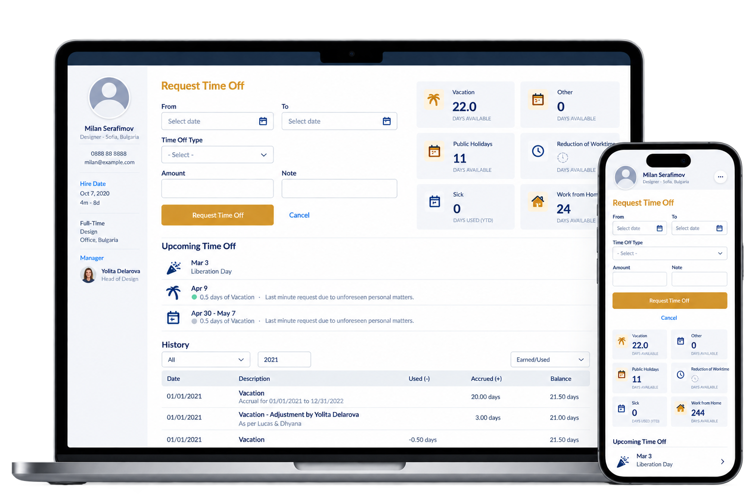
Multiple digital products across different teams had different visual styles, components and interaction patterns. This led to inconsistent user experiences, slower development and higher maintenance costs.
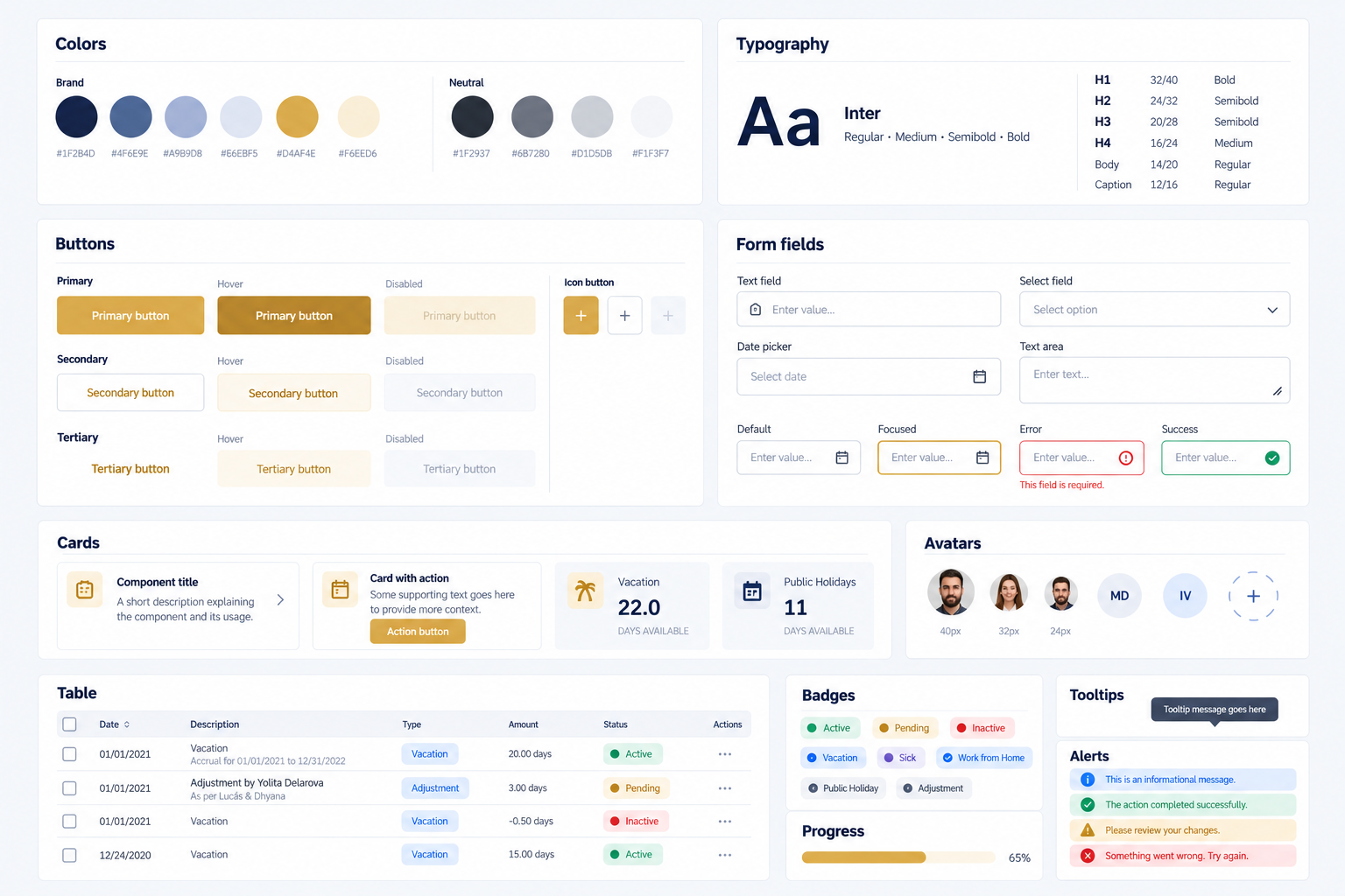
Different visual patterns across products.
Repeated design and development work.
Higher maintenance costs over time.
Unfamiliar patterns for end users.
Build a consistent visual language and component library to be used across all Olympus digital products, improving efficiency, consistency and the overall user experience.
One recognizable experience.
Faster design and development.
Shared foundations for teams.
A flexible, future-ready library.
A structured, collaborative process to understand user needs, define foundations and create a flexible, scalable system.
Stakeholder interviews, product audits and key pain points.
Design principles, information architecture and component strategy.
UI components, patterns, templates and documentation.
Testing with teams, iteration and implementation readiness.
A flexible, easy-to-use system that provides clear guidelines, reusable components and visual consistency across Olympus products.
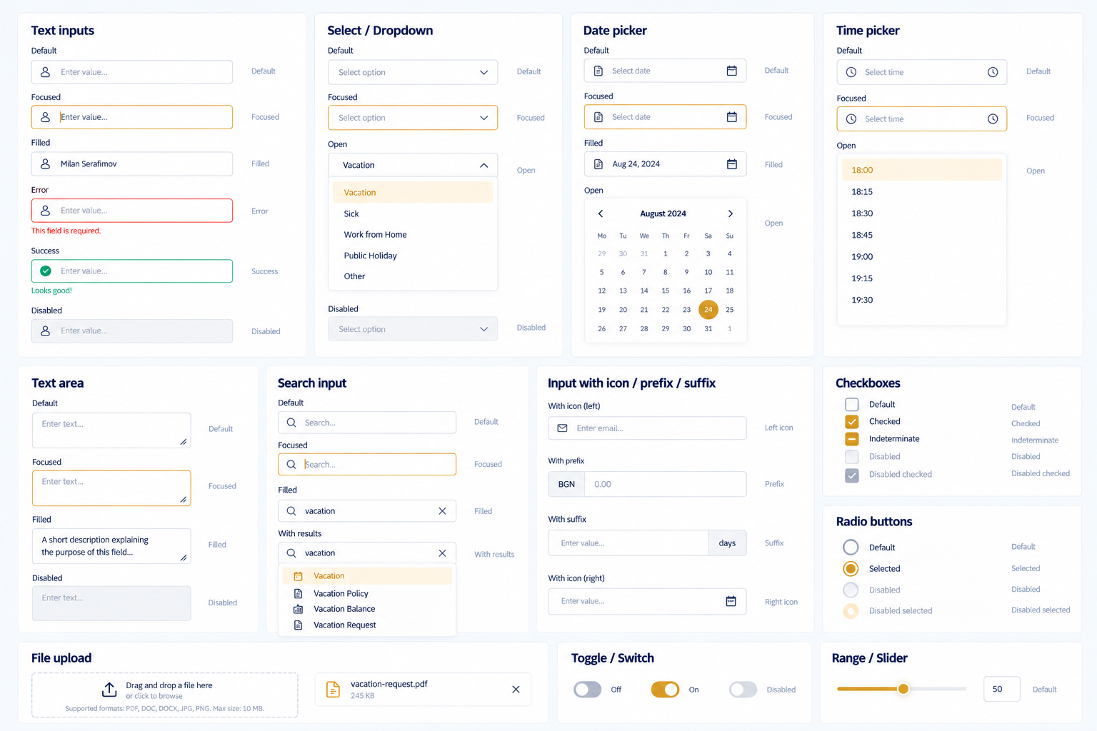
A complete set of foundations, components and patterns designed to cover real-world use cases.
Buttons, inputs, forms, tables and modals.
Common workflows and reusable layouts.
Typography, color, spacing and iconography.
Usage guidelines, accessibility and best practices.
The design system improved collaboration between teams, accelerated development and created a more unified experience across Olympus digital products.